From concept to launch, we deliver exceptional websites
using a comprehensive,
user-centric approach. Our focus on intuitive design and
agile methodologies ensures
solutions that surpass expectations. We create
responsive, SEO-friendly websites that
captivate and engage visitors.
Our expert team leverages cutting-edge technologies to
develop high-performance apps for
iOS and Android. We prioritize user experience and
functionality, crafting mobile solutions
that captivate and retain users.
We design scalable, tailored cloud solutions to meet your
business needs, ensuring
efficiency and cost-effectiveness. Our cloud services
optimize your operations with secure,
reliable, and flexible infrastructure.
We build robust, scalable e-commerce solutions customized
to your brand. Our platforms
are designed to enhance user experience, boost sales,
and elevate your online presence
Our intelligent solutions provide valuable insights,
automate processes, and deliver
personalized user experiences. We harness the power of
data to drive innovation and
efficiency in your business.
We connect the physical and digital worlds by creating
IoT solutions that enhance
connectivity and streamline operations. Our developments
improve efficiency and offer
real-time data insights.
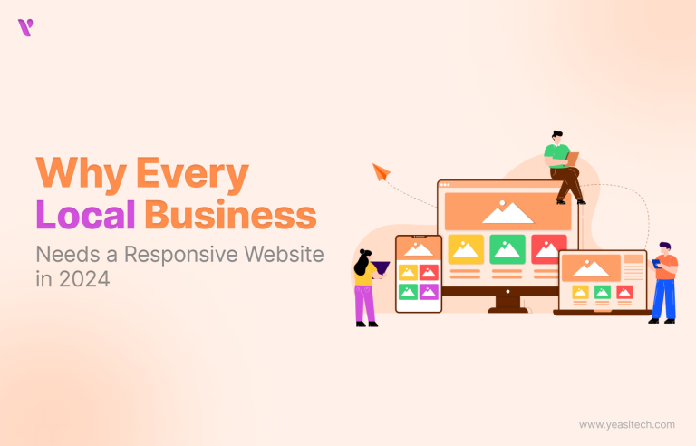
Why Every Local Business Needs a Responsive Website in 2025
24 June, 2025Last Updated
12 minutesRead
1946Views
The need for small businesses to develop a mobile-friendly website is greater than ever in 2025. A flexible website is not only a nice idea, but also essential for businesses looking to increase their online visibility and retain consumers, as more people use mobile devices.
This blog looks at why responsive design is so important, how it affects businesses, and practical steps for making websites work well on both desktop and mobile. Real-world success stories, industry insights, and fresh data will also be shared.
Table of Contents
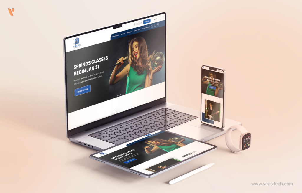
What Is a Responsive Website?
Responsive web designers create websites that automatically adjust their layout to accommodate any screen size. This website functions and appears excellent on computers, tablets, and phones.
In order to adapt the design to the screen size of the device, responsive web design makes use of flexible grids, layouts, images, and CSS media queries. One website that functions flawlessly across all displays is made feasible by responsive design, as opposed to developing several versions of a website for every device.
In 2025, most people use their phones to browse websites. According to a report from Statista, mobile devices accounted for 58.43% of all internet traffic in the first three months of this year. If your website doesn’t work well on phones, you could be missing out on nearly half of your potential visitors.
Why Is Responsive Design Essential?
A responsive website works effectively on PCs, tablets, and smartphones by adjusting to the screen. By 2025, mobile devices will make up about 60% of all internet traffic, indicating that most customers prefer to browse on their phones. Local businesses must focus on developing mobile-friendly websites in order to stay competitive, as search engines like Google now rank websites based on how well they work on mobile devices.
The Importance of Responsive Design for Local Businesses
The internet strategy of local businesses must include a responsive website. It promotes user experience, increases engagement, and contributes to a rise in revenues.
Higher Search Rankings: Websites that work well on mobile phones show up higher in Google search results.61% of people using mobile phones say they won’t come back to a website if it’s hard to use. Businesses can get more visitors and improve their chances of appearing in searches by making their websites easy to use on mobile devices.
Better User Experience: A responsive website provides a uniform experience on all devices. Because of the confidence this consistency builds, users are more inclined to interact with the provided material and services.
Cost-Effectiveness: It is less expensive to maintain a single responsive website than to keep separate desktop and mobile versions. This simplifies content management and reduces development expenses.
91% of Indian small businesses recognize the value of having a mobile-friendly website, according to a 2023 Statista study. In reality, though, just 61% of them have websites that adapt appropriately to various screen sizes. The gap represents a significant opportunity for development. Companies are more likely to draw clients and succeed in their local markets if they make their websites responsive to mobile devices.
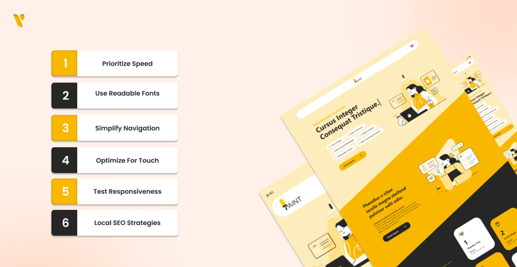
Creating a responsive website calls for a number of strategies and best practices intended to improve user performance and engagement, not just looks:
1. Prioritize Speed
A website must be quick for a positive user experience. You can use Google Page Speed Insights to see how quickly your website loads. A few simple methods to make a website faster are as follows:
Minimize HTTP Requests: To make your website load faster, use fewer items on it.
Image Optimization: Reduce file size to load photos faster without losing quality. You can use TinyPNG to help with this.
Use Browser Caching: This helps speed up loading for repeat visits by storing certain data on users’ devices.
2. Use Readable Fonts
Choose the right font carefully. Make sure the text is easy to read by leaving appropriate space between lines. You should be able to see and read the font easily, even on small screens. You should be able to see and read the font easily, even on small screens.
3. Simplify Navigation
Users should find the navigation easy to use and understand. Mobile devices typically use a hamburger menu that expands to reveal alternatives without using much screen space.
4. Optimize for Touch
Ensure that links and buttons are large enough for easy tapping. Maintaining touch targets at least 44×44 pixels is a decent rule of thumb.
5. Test Responsiveness
Verify your website’s functionality and appearance across a range of devices and screen sizes. You can view how your website looks on different screens using tools like BrowserStack without owning any devices.
6. Implement Local SEO Strategies
Due to their reliance on foot traffic, small businesses can greatly improve their visibility through the usage of local SEO tactics. This comprises:
Including Local Keywords: To attract local clients, incorporate geo-targeted keywords into the content and metadata of your website.
Making a Google My Business Listing: Make sure that your business is listed and search engine optimized for locality.
The Growing Importance of Mobile-Friendliness and Responsive Design
Let’s look into the growing importance of mobile-friendliness and responsive website design:
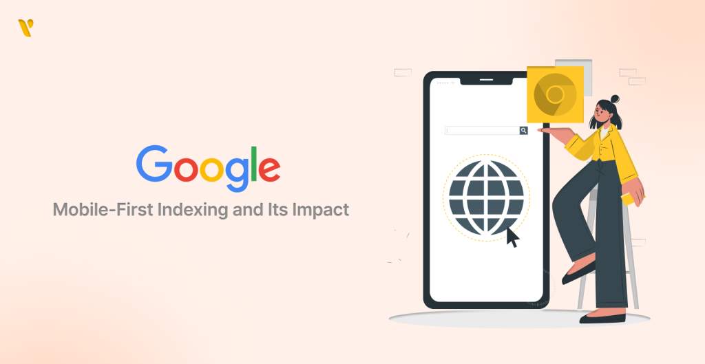
1. Google’s Mobile-First Indexing and Its Impact
In 2019, Google began to prioritize mobile-friendly webpages. This implies that when evaluating how to rank a website in search results, it first considers its mobile version. This change should be noted by local businesses. Google declared in 2025 that almost all websites are now indexed based on their mobile version.
A website could not rank as highly in search results if it is not responsive. People have a tougher time finding it because of this. A study by Search Engine Journal found that websites that are made to work on mobile phones are 32% more likely to appear on the first page of Google.
“As more people access information and services on their mobile devices, the shift to mobile-first is no longer optional but essential for any business aiming for online visibility.”- Sundar Pichai, CEO of Google
2. Rising Mobile Usage: A Data-Driven Insight
Mobile usage has increased over the past several years, and according to recent studies, mobile devices remain the most popular way to access the internet. Over 60% of all internet traffic worldwide is attributed to mobile devices, according to a Statistaestimate. In India, where more people have access to mobile phones, this number is much higher.
This study points out an important problem for local businesses in India: if you don’t pay attention to mobile users, you are missing out on many potential customers. For example, more than 75% of food orders on apps like Swiggy and Zomato come from mobile phones. This shows a global trend in which people in practically every industry are opting to use their phones first.
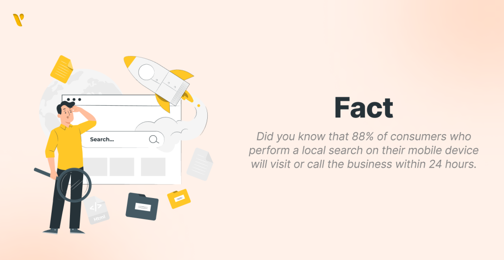
Mobile-friendly websites are particularly important for attracting local search traffic because customers are always searching for local providers. The word “near me” has been used in more than 500% more searches during the past five years, according to Google, and most of these searches are conducted on mobile devices. If a local business’s website works well on mobile phones, it is more likely to show up in local search results.
Real-Life Case Studies
Let’s look into some Indian Market Success Stories and learn from them:
1. Chumbak: Embracing Mobile Commerce
A responsive website was introduced by Chumbak, a lifestyle and home decor company, to increase its mobile user base. Given that the majority of Indian internet users access websites through mobile phones, Chumbak recognized the importance of upgrading the user experience across various devices. The business updated their website to make it fully responsive, which improved device load times and navigation.
Impact & Results:
Sales Increase: In the first quarter following the introduction, Chumbak’s online sales increased by 30%.
User Engagement: A 20% decrease in mobile bounce rates indicated that users were spending more time perusing the products in the store.
Use Case
Chumbak is a model for comparable companies in the industry since its example shows how a responsive web design may immediately lead to higher sales and client retention.
“Our goal was to create an enjoyable shopping experience for our customers, regardless of the device they used. The results have been outstanding.” – Shubhra Chadda, Founder of Chumbak
2. Zomato: Optimizing for Local Searches
As a food delivery giant, Zomato realized that local searches heavily relied on mobile-friendly websites. To stay ahead of the competition, they invested in a responsive site design that could function on various screen sizes and speed up loading times. The website of Zomato was created to offer quick access to menus, reviews, and delivery options, particularly in tier-2 and tier-3 cities.
Impact & Results:
Improved Load Times: The responsive website reduced loading times by 50%, crucial for retaining impatient customers.
Higher Conversion Rates: Zomato noted a 25% increase in orders placed through mobile devices post-implementation.
Use Case:
Zomato’s approach shows how local food businesses may use flexible websites to increase sales and improve customer satisfaction.
If you want to know how much it costs to build an app like Zomato, check our blog here!
3. Mamaearth: Capturing the Millennial Market
The Indian skincare company Mamaearth realized that young parents and millennials, who make up their target market, mostly shop online using mobile devices. In order to engage this audience, a responsive website was essential. The company redesigned its site to enhance mobile user experience, featuring easy navigation and optimized product pages.
Impact & Results
User Retention: Mamaearth experienced a 40% increase in return visitors, showing that a responsive site encouraged repeat business.
Social Media Integration: The site saw a 60% rise in traffic from social media channels, thanks to better mobile compatibility.
Use Case
Mamaearth’s story highlights how responsive web design can increase younger consumers’ brand loyalty.
4. Lenskart: Shaping the Eyewear Sector
One of the leading sellers of eyeglasses, Lenskart, struggled to convert online visitors into sales. They required a website that functioned well across all screens because the majority of their visitors were on mobile devices. The adaptable design of Lenskart’s redesigned online platform makes it simpler to view its extensive product selection on smaller displays.
Impact & Results
Sales Improvement: Lenskart reported a 35% rise in sales from mobile customers following its debut.
Better User Experience: Customer satisfaction ratings significantly increased as a result of 90% of consumers stating that they preferred to shop on their mobile devices.
Use Case
The change at Lenskart shows how important responsive design is for companies looking to turn mobile traffic into revenue.
5. FabIndia: Connecting Experiences Online and Offline
In order to improve client accessibility to its stores and merchandise, FabIndia, a reputable ethnic clothing brand, wanted to broaden its online presence. To facilitate easy and seamless shopping, the company developed a versatile website with e-commerce features and store locators.
Impact & Results
Increase in Foot Traffic: After redesigning their website, FabIndia saw a 15% increase in foot traffic to their physical stores.
Online Sales Growth: The revamped website resulted in a 50% increase in the brand’s online sales.
Use Case
The example of FabIndia emphasizes how important responsive websites are for increasing sales both online and offline, especially for physical businesses.
Wrapping Off
Responsive web design is the process of developing websites that work correctly on all devices, including PCs, tablets, and smartphones. It’s not just a trend; it’s crucial for a smooth and enjoyable user experience. Whether you’re making a personal blog, commercial website, or online store, a flexible design is necessary for success in today’s digital world.
If your website doesn’t adjust to different screen sizes yet, it’s time to upgrade. At YeasiTech, we create websites that look great and function properly on any device. Let’s work together to make sure your online presence is future-ready and helps your business grow!
Contact us today to start building a responsive website tailored to your audience’s needs and designed to boost your profits.
FAQ’s
1. What is a responsive website?
A responsive website adapts its layout and content for optimal viewing across devices, ensuring easy navigation on desktops, tablets, and smartphones.
2. Why is responsive design important for local businesses?
Responsive design enhances user experience, boosts search engine rankings, and increases conversion rates, making it essential as mobile usage continues to rise
3. What are the benefits of a responsive website?
Benefits include better user experience, higher conversion rates, and cost savings by managing a single site instead of multiple versions.
4. How can businesses optimize their sites for mobile users?
Local businesses can optimize by using flexible layouts, compressing images, enhancing navigation, improving loading speed, and testing across devices
5. Where can businesses find help with responsive design?
Resources like web design agencies and platforms such as YeasiTech provide valuable tools and insights for implementing responsive design.
6. What is the difference between a responsive website and an app?
A responsive website adapts to different screen sizes, ensuring optimal viewing on any device via a web browser. An app, on the other hand, is a standalone software that must be downloaded and installed on a mobile device or computer.
7. How does a responsive website compare to a native app?
A responsive website works across all devices without installation, making it cost-effective and easier to maintain. A native app, built specifically for iOS or Android, offers better performance, offline access, and deeper integration with device features.
8. What’s the difference between a responsive website and a PWA?
A responsive website ensures accessibility on any screen, but a PWA improves this with app-like features such as offline access, push notifications, and faster performance, while still running in a web browser.
9. What CSS techniques are used to make a website responsive?
Key CSS techniques include: 1. Media Queries (@media) to apply styles based on screen size 2. Flexible Grid Layouts using CSS Grid and Flexbox 3. Relative Units (%, em, rem, vw, vh) for fluid sizing 4. Responsive Images (max-width: 100%) to scale appropriately